Jifflenow Design System
Jifflenow is a B2B meeting scheduling app and sales advancement platform. As the sole visual designer at Jifflenow, I was responsible for bringing the platform up to date with the latest visual trends and interaction patterns. To achieve this, I started by creating a mood board and evaluating various products in the current SaaS market. I then overhauled the entire design system and created all the flows for the Onboarding screens for the web and iPad, the Book meeting flow, and the Meeting list feature. These updates were shipped to the customers, resulting in their happy feedback and boosting my confidence in product design.
Colours and Swatch elements
Vibrant colours and subtle gradients are current UI trends. When designing a design system for a product like Jifflenow, I ensured that it was readable for our end users who are 40+.

Fonts and Typography
Multiple text elements of different sizes, including button copy, field tables and section headers, require a typeface that works well in various sizes and weights for readability and usability.

Icons
Icons play a crucial role in determining the efficiency of any application or website. They have the ability to interact with the user, providing support, engagement, encouragement, clarification, and simplification. Line icons can enhance the interaction speed, enabling you to prioritize text while also decorating and entertaining the user.

Buttons

Text fields

Checkboxes &
Radio buttons

Notifications

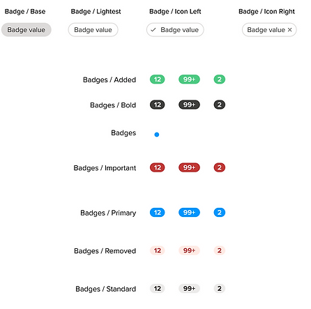
Badges
Dropdowns

Designing Dark Mode
Dark Mode is used for reducing the light emitted by device screens while maintaining the minimum colour contrast ratios required for readability. Whether you want to reduce eye strain, improve battery life, or just have aesthetic appeal, Dark Mode exemplifies our ability to craft simple and powerful experiences that gives you choice and flexibility.
Today’s fast and fluid world constantly blurs the lines between work and life, and we believe in meeting people where they are. This often means viewing calendars and scheduling meetings in places where the default white mode may be less suitable.
Our design research specifically focused on these contexts where people would want to use Dark Mode, and the response was very positive. While some Dark Mode experiences can be neon or overly bright, people felt that Jifflenow mobile app kept the kind of relaxed feeling you might want in a dimly lit environment. They described the experience as comfortable, crisp, clear, and aesthetically pleasing, a nod to how Dark Mode can reduce eye strain.
Starting from the ground up and using the new grey palette for Jifflenow, I started by aligning to the single palette. This included increasing contrast, brand color saturation, and consistency among details like how and when we use shadows when in Dark Mode.
Buttons
![UI Controls [Buttons].jpg](https://static.wixstatic.com/media/0728ea_a37561b9ff994d18ae7c014061659ff0~mv2.jpg/v1/crop/x_231,y_160,w_2169,h_736/fill/w_761,h_258,al_c,q_80,usm_0.66_1.00_0.01,enc_avif,quality_auto/UI%20Controls%20%5BButtons%5D.jpg)
Toggles
![UI Controls [Buttons].jpg](https://static.wixstatic.com/media/0728ea_c2f31d21f48346bfa690dcdba6329fb3~mv2.jpg/v1/crop/x_291,y_254,w_1834,h_394/fill/w_642,h_138,al_c,q_80,usm_0.66_1.00_0.01,enc_avif,quality_auto/UI%20Controls%20%5BButtons%5D.jpg)
Text fields
![UI Controls [Buttons].jpg](https://static.wixstatic.com/media/0728ea_c2f31d21f48346bfa690dcdba6329fb3~mv2.jpg/v1/crop/x_309,y_831,w_1777,h_2394/fill/w_622,h_838,al_c,q_85,usm_0.66_1.00_0.01,enc_avif,quality_auto/UI%20Controls%20%5BButtons%5D.jpg)
Check boxes &
Radio buttons
![UI Controls [Buttons].jpg](https://static.wixstatic.com/media/0728ea_c2f31d21f48346bfa690dcdba6329fb3~mv2.jpg/v1/crop/x_309,y_3585,w_1797,h_626/fill/w_629,h_219,al_c,q_80,usm_0.66_1.00_0.01,enc_avif,quality_auto/UI%20Controls%20%5BButtons%5D.jpg)
